")
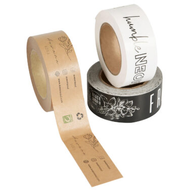
Designing eye-catching printed tape for your brand is a fantastic way to boost brand visibility and make your packaging stand out. Here’s a step-by-step guide to help you create tape that truly represents your brand and grabs attention:
1. Understand Your Brand Identity
- Colors: Use your brand’s primary colors to maintain consistency.
- Logo: Incorporate your logo clearly but not too large to overwhelm.
- Typography: Choose fonts that reflect your brand personality and are easy to read on tape.
2. Keep It Simple and Clear
- Printed tape is usually viewed quickly, so keep the design clean.
- Use bold and simple graphics or text that can be easily recognized from a distance.
3. Choose the Right Size and Layout
- Ensure your text and logos are sized appropriately to be legible on the tape’s width.
- Consider repeating patterns or alternating logos and taglines for a dynamic look.
4. Use High-Contrast Colors
- Make sure text and graphics stand out against the tape background.
- Dark text on a light background or vice versa often works best.
5. Add a Catchy Tagline or Website
- A short tagline or website URL can help reinforce your brand message.
- Keep it concise and readable.
6. Incorporate Unique Graphics or Icons
- Simple icons related to your business (e.g., leaves for an eco brand) can add personality.
- Avoid clutter—less is more.
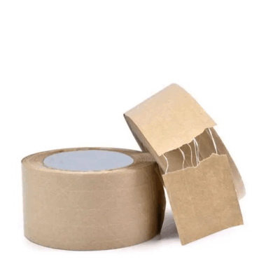
7. Think About the Tape Material and Finish
- Matte or glossy finish can affect how colors and designs appear.
- Some finishes enhance the vibrancy of printed colors.
8. Proof and Test Your Design
- Print samples to check legibility, color accuracy, and overall appeal.
- Test how the tape looks on your actual packaging.
Bonus Tip: Consider seasonal or promotional versions of your printed tape to engage customers and create a fresh look.
Would you like help creating a sample printed tape design for your brand?